Letters – they’re special from A to Z. They’ve been around for millennia, forming the things we say and the words we read.
Some, though, stand out more than others. Depending on the typeface used, especially when serifs are used, they can stick out like a sore thumb, damaging the cohesion of your copy.
Letters like ‘X’, ‘Q’, and ‘Z’ are the “bad boys”. They’re less common than most and are generally jagged in shape.
‘g’, ‘b’, and ‘p’: These stand out because they drop or raise from the average letter baseline.
So, what can I do to fix it?
I’ve found a couple easy tricks to solve the stand-out letter problem.
Solution #1: Try a different font.
Your design might need a fresh look. Whether you change the whole copy, or just the unique letter, make sure it remains cohesive to the rest!
Solution #2: Scale.
Sometimes the best solution is reduction. Say the ‘Q’ stands out too much in ‘Question #1’. Fiddle around with the type size toggle and adjust spacing as needed.
Lastly, solution #3: Embrace it.
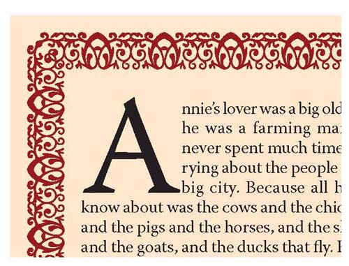
Jump into the quirkiness of a letter. Incorporate it into the design elsewhere, or, contradictory to my last point, scale it up! Look at the drop caps in old books, for example. Sometimes more is more!